Notice on the Replacement of the Old and New Logos of LEELEN
Since 1992, LEELEN’s brand logo has undergone several iterations and upgrades.
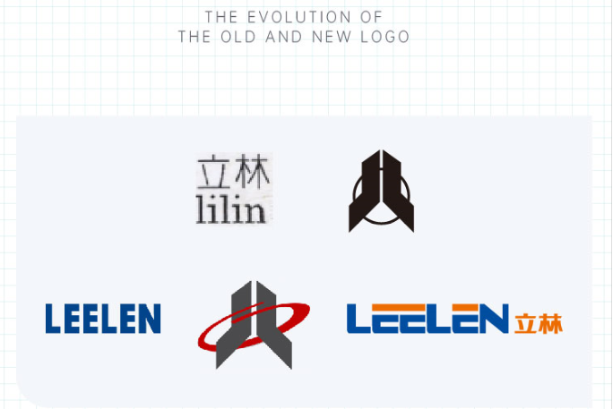
"Connection", "openness" and "vitality" are the key words of this brand upgrade.
This upgrade covers all aspects of the brand font, standard colors, and visual system.
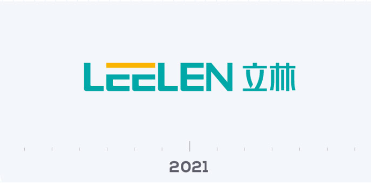
We have fine-tuned the font, spacing and width of the new logo to make it more stylish, lighter and more breathable. We use a square composition to represent LEELEN’s brand DNA of "safety".
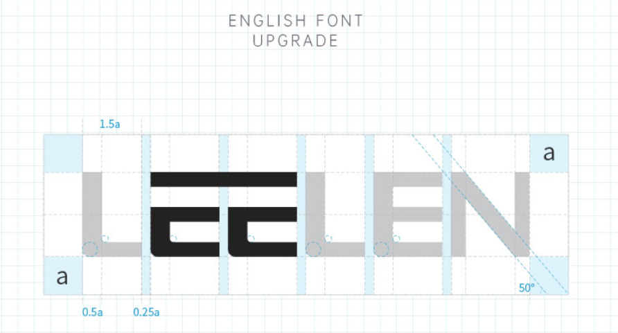
The top of the English "double E" continues the through design approach, representing LEELEN's emphasis on the connection between technology and life, brand and users, company and employees, and humanities and science.
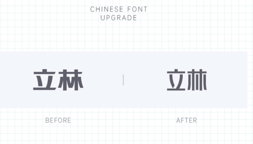
The two internal points of the Chinese character "立" adopt curved strokes, conveying LEELEN's attitude of "couple hardness with softness" to its ecological partners.
The removal of the middle line of the Chinese character "林" represents the upgrade from "hand-in-hand" to "shoulder-to-shoulder" between LEELEN and its ecological partners, from cooperation to deep association, to realize LEELEN's business philosophy of "openness, cooperation, altruism and win-win".
The new brand colors "LEELEN Cyan-blue” and "LEELEN Red Orange" continue the original brand colors of blue and orange. However "LEELEN Cyan-blue” has the meaning of cyan-blue coming from Indigo blue is extract from the indigo plant, but is bluer than the plant it comes from. It is our inheritance and transcendence of the past, and the embodiment of LEELEN's vision of "building an international brand and a long-lasting foundation".
LEELEN Red Orange is the finishing touch of the whole LOGO; it is like the warm light at home, reminding us to focus on smart life with "quality heart" and "sincere heart", to create good products, and to practice the corporate mission of "let everyone live in a five-star home".
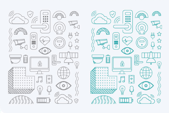
We also derived the "ecological chain" auxiliary graphic to convey LEELEN's strategic goal of "focusing on the community sector, building an ecological chain of smart living products, and realizing the interconnection of everything". We will realize the digital transformation of LEELEN's industry by creating a new model of community digital economy that unites the Internet of Things, the Internet and the Internet of Services.
At present, LEELEN's new brand visual image has been applied in various communication media, and we can see its figure on the channels including the official website, online shopping mall and offline terminals. A better LEELEN is coming to us.
For inquiries about our products or pricelist, please leave to us and we will be in touch within 24 hours.
 No.780, Tieshan Road, Guankou Town, Jimei District, Xiamen City, Fujian, P.R.China
Copyright © 2024 Xiamen Leelen Technology Co.,Ltd.. All Rights Reserved.

IPv6 network supported
Friendly Links:
Turnstile Manufacturer Hydxradio Walkie Talkie Wholesale Interactive Whiteboard Retractable Screen System RFID Professional Manufacturer RFID Tag Manufacturers PTZ Video Cameras Magnetic levitation sliding door system wintoplens njtokensensor s4a access semilanxi dzbreakers Villa Elevator Home Lift OEM RFID Factory
 English


